
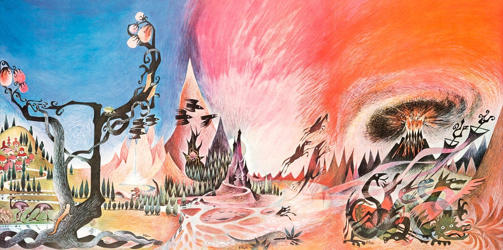
The Lord of the Rings (LOTR) artwork produced for the first authorized American printing has become iconic among its cult-like following. LOTR is one hero’s story split into three sections. Frodo Baggins, the hero, sets out to destroy the Ring, a valuable and powerful artifact, and faces his own demons and destiny. Achieving considerable success in the United States, this piece of artwork became synonymous with Middle-Earth in the 1960s. Originally one painting, it was divided into 3 for use as artwork covers for the entire trilogy, as well as the first copy of The Hobbit. In honor of Barbara Remington’s death this year, I’d like to look at the artwork she designed.
The first authorized American printing of the LOTR trilogy was by Ballentine Books, in 1965. The covers were created from a series of images produced by Barbara Remington that was later produced whole, in poster form— “Wilderness Poster.” The poster image continues the design from each book, making it a single image—much like the format of the trilogy.
Coded Meaning
Panel 1: The Fellowship of the Ring
The background displays a village on a hill, representing the hobbit’s home—the ordinary world. The tree is often a symbol of darkness or the unknown, and this one bears fruit despite its twisted, gnarled branches that lack leaves. In the forefront, surrounding this tree are various small creatures. It feels as if they are each looking at you. This is the other world that Frodo journeys towards.
Panel 2: The Two Towers
The mountain takes the focal of this panel, a variety of sharp peaks in descending shades against the vibrant sky. Black creatures leap away, signifying the presence of evil, darkness, and/or the unknown. A spider lurks nearby, unnaturally large. Frodo has reached the initiation stage and faces trials. He gains allies, but must gather more, as he is still lacking in some way. The way to the towers is winding and guarded by a dark thick forest; creatures are dying in the water around it. This is where our hero must head.
Panel 3: The Return of the King
The center of it all, and the focal, is the erupting volcanic mountain. It is surrounded by dark foreboding mountains, a cloud of ash, and an angry, dirty, red sky. This must be the place of Frodo’s supreme ordeal and return.
Illustrator
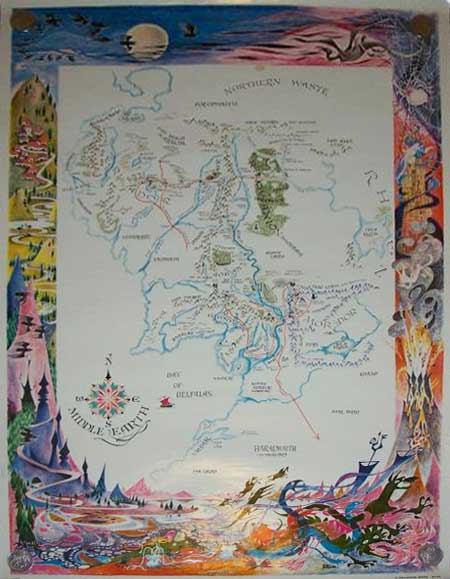
Barbara Remington was an American illustrator best known for this piece, as well as A Map of Middle-Earth, which can be viewed at Tolkien Guide. A self-proclaimed ring-nut, the artwork for the LOTR’s covers was completed prior to reading them—something she regretted (Connecting with History). The reason for the rushed artwork was due to a need by Ballantine’s books to release things quickly. Tolkien had been reluctant to give permission for publication in the United States, but Ace Books had released an unauthorized copy of The Fellowship of the Ring. After its popularity, Tolkien granted permission to Ballantine Books, who broke all the unwritten rules to push publication of all three books at once. As a result, some of the details in the cover are inaccurate, such as the lions (which were painted over in later releases), and the fruit tree.
The artwork used on the covers became iconic for book covers of the 1960s, inspiring similar book covers, such as the parody Bored of the Rings. It ushered in a new stage for mass market paperbacks, and its success is directly linked to the launch of the Ballantine Adult Fantasy Line (Brown). The imagery became linked with the authorized version, and the poster could be found everywhere.
Time Period Artwork
During the time of designing, Barbara lived in New York, a frequent visitor of the East Village, “a haven for starving artists, musicians, poets and philosophers of that time” (Remington, Connecting with History). She was friends with counter-culture icons such as Timothy Leary (psychedelic philosopher), Allen Ginsberg (beat poet), and Ira Cohen (poet and filmmaker). The 1960s saw major changes in art design primarily as a result of counter-culture influences and the psychedelic movement of the mid-1960s.
“The visual motifs of psychedelic art include Art Nouveau-inspired curvilinear shapes, illegible hand drawn type, and intense optical color vibration inspired by the pop art movement” (Psychedelic 60s).
The most obvious outcome of this move in art was on album covers and festival posters. These frequently featured “a strong color palette—usually of contrasting colors—along with ornate lettering and kaleidoscopic swirls” (arthistory). It often contained spirals, concentric circles, and surrealist subjects.
Audience
Although The Hobbit and the LOTR series are written in an overall tone and mannerism for children, Tolkien has stated that they were written for adults (J.R.R. Tolkien Dead). The series launched the fantasy genre, paving the way for other classics, such as The Last Unicorn, which also features psychedelic artwork. Ballentine Books would have marketed with the goal of reaching both (older) children and adults, particularly those who read content such as “Amazing Stories,” the first science fiction magazine.
The imagery of the “Wilderness Poster” and of the LOTR covers had a large deal of influence on the future designs of fantasy covers, including the cover of the parody Bored of the Rings. While it wasn’t able to hit every goal of its illustrator and did not incorporate the full message of the books, it proved to be effective, both from a marketing and art standpoint. Found hanging on walls and sitting on shelves across America, this piece influenced its audience.
